From Handbills to the Grid: A Brief History of Page Layout
Page layout history helps you see how print constraints shaped columns, margins, and grids, so you can choose a structure that fits the reading task.
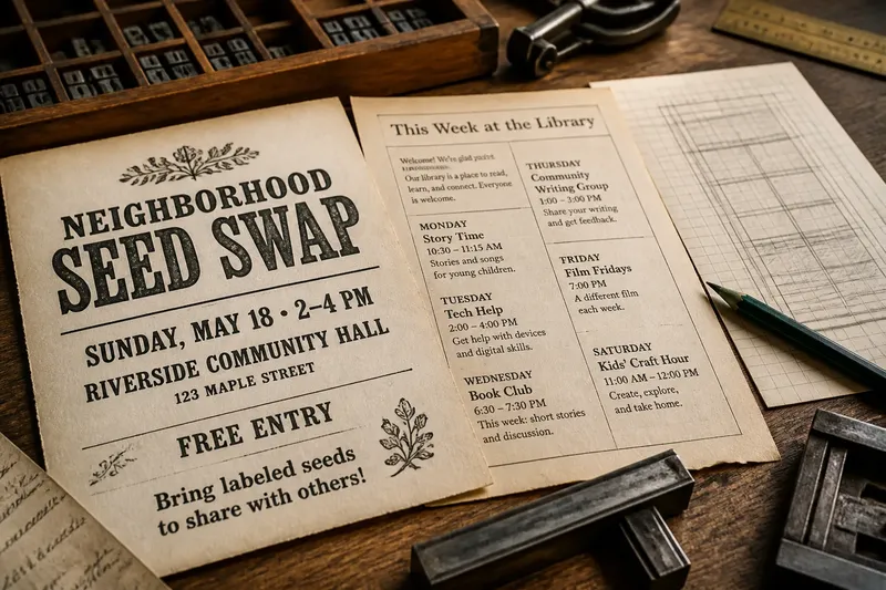
Page layout history is easiest to see in a crowded community notice: a title, a date, and several details all pressed into one sheet. The useful question is not which item should shout loudest, but how the page’s structure supports a particular reading task.
Printed layouts have never followed one universal path. Their forms reflect the material and purpose at hand: the size of the sheet, the amount of type, the tools available, and whether readers need to follow a continuous text or pick out separate entries. Treating these as practical pressures, rather than a tidy timeline, makes the history more useful for making pages now.
Handbills adapted to the limits of a sheet
A handbill had to carry its message on a single piece of paper. Printers arranged type within that boundary, often making choices shaped by available type and the space required by the words. The result could be a compact notice, but fitting everything was only part of the task: readers also needed to locate the event or instruction.
For a present-day handbill, start by separating the information by purpose. The event name identifies what the notice is about; the date and place let someone decide whether to attend; extra notes explain what to bring or expect. This is not simply a matter of making one phrase large. It is a way to let each kind of information do its job without turning the page into a contest for attention.
Say you are designing an invented handbill for a neighborhood seed swap. The starting copy includes the event name, a date, a venue, a free-entry note, and a request to bring labeled seeds. First, group the date and venue as attendance details; next, keep the event name distinct from that group; then place the entry note and seed request together as supporting instructions. The expected result is a notice whose separate functions are easier to pick out, even if none of the details is treated as decoration.
Columns organize different kinds of reading
Columns are useful when the page contains separate entries or when a long passage needs a clear path. They can also make a page harder to follow if readers cannot tell where one item ends or which column comes next. A column is a structural choice, not an automatic fix for a crowded sheet.
For continuous prose, use a reading path that carries the eye through the text without an ambiguous jump. For a directory or set of notices, repeated entries can make columns easier to scan, provided each entry has a clear start. Rules, headings, or consistent spacing can mark those starts; choose the lightest cue that makes the organization apparent.
Imagine an invented library leaflet with a short welcome paragraph and a list of weekly activities. The starting material contains one continuous paragraph and several individual listings. Keep the welcome text as a single passage, then group the activities into repeated entries; if readers can follow each listing without mistaking one for the next, the column structure is doing useful work. If the entries run together, add clearer separation or return them to a single column.
Margins define the page’s working area
Margins separate type from the edge of the sheet and give the page a stable frame. They can also preserve room for handling or binding. When text feels squeezed against the edge, the problem may be that the content no longer fits the space planned for it.
Before shrinking the main text, look for repeated wording or details that can be shortened. If a page still feels crowded, consider moving supporting material to another page or giving it a quieter treatment. The decision should follow the reading need: retain legible essential information, and revise or relocate material that does not need to compete for the same space.
Alignment gives that working area internal order. Related headings, paragraphs, and captions can share an edge, while a deliberate exception can mark a different role. Without a reason for changes in alignment, readers may have to work out whether the shifts carry meaning.
A page structure should follow its content
A grid is an underlying plan for alignment, spacing, and repeated units. It can help a designer keep a set of notices consistent without making every item identical. A long title, a short instruction, and a caption may need different amounts of room while still belonging to the same page structure.
Start by identifying what readers need to do: read a continuous argument, compare entries, find a date, or follow instructions. Then group related material and decide whether those groups need columns, shared edges, or more separation. Let the structure make relationships clear; do not force content into boxes that obscure those relationships.
As a practical check, cover the decorative elements and look at the remaining arrangement. If the order and grouping still make sense, the structure is carrying the page. If not, revise the relationships before adding visual flourishes.
Which layout choice fits the page?
Why does a printed page feel crowded?
It may contain more information than the available space can comfortably hold, or the gaps may not distinguish related items from separate ones. Remove repetition or regroup the content before reducing the main text.
When should I use columns?
Use columns when they clarify a continuous reading path or help organize separate entries. If readers are likely to jump unpredictably between columns, simplify the arrangement or mark the sequence more clearly.
What are margins for in a layout?
Margins give the type a boundary and keep the page’s content distinct from its edges. If text crowds that boundary, check whether the copy needs editing or a different page arrangement.
Does a simple flyer need a grid?
A small grid can help align a title, details, and instructions without making the flyer rigid. Use it when repeated relationships need consistency, and relax it when a particular item needs a different amount of room.
Check the structure before styling the page
These checks connect a layout choice to an observable condition and a next action:
- Check whether the event name is easy to locate; if it blends into the details, give it a distinct position, or shorten the surrounding copy if space is tight.
- Check whether date and venue appear together; if they are separated, place them in one attendance-details group, or add a clear cue connecting them.
- Check whether a column contains awkwardly broken words; if it does, widen the column or move that content to a single-column arrangement.
- Check whether readers can tell where each listing begins; if they cannot, add consistent spacing or a heading, or remove the column split.
- Check whether type crowds the page edge; if it does, edit or relocate secondary material, or revise the page arrangement before shrinking essential text.
- Check whether related headings and captions share a clear alignment; if they do not, align them to a common edge, or make each different position communicate a distinct role.
For the seed-swap handbill, the starting inputs are the event name, date, venue, free-entry note, and request to bring labeled seeds. Group the date with the venue, set the event name apart, and place the two supporting notes together. Then check whether the title, attendance details, and instructions can each be located without confusing one group for another. If the supporting notes crowd the sheet, shorten or relocate them; if the groups remain distinct, keep the arrangement. The resulting decision is based on the page’s actual content, not on a historical layout rule.
Page layout history can sharpen that decision. Columns, margins, and grids are options for organizing material under particular constraints, not steps in a single march toward a correct design. Start with what readers need to find or follow, and let the page’s structure serve that task.